Hi! We’re Parabo Press
We share in your joy, celebrate your story and help you hold onto life’s moments with thoughtfully-designed photo prints.
Shop Prints
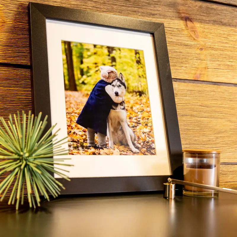
Meet Our New Framed Prints
Capture your favorite snapshots in a beautiful frame with our brand-new Framed Prints.
Shop Framed Prints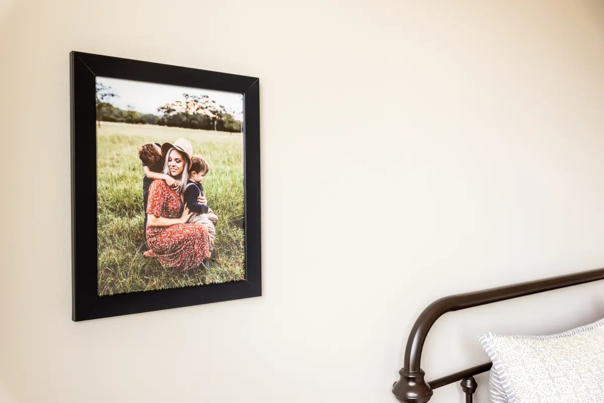
Photo Books
Cherish your favorite memories forever with a custom Photo Book starting at just $12.
Shop Photo Books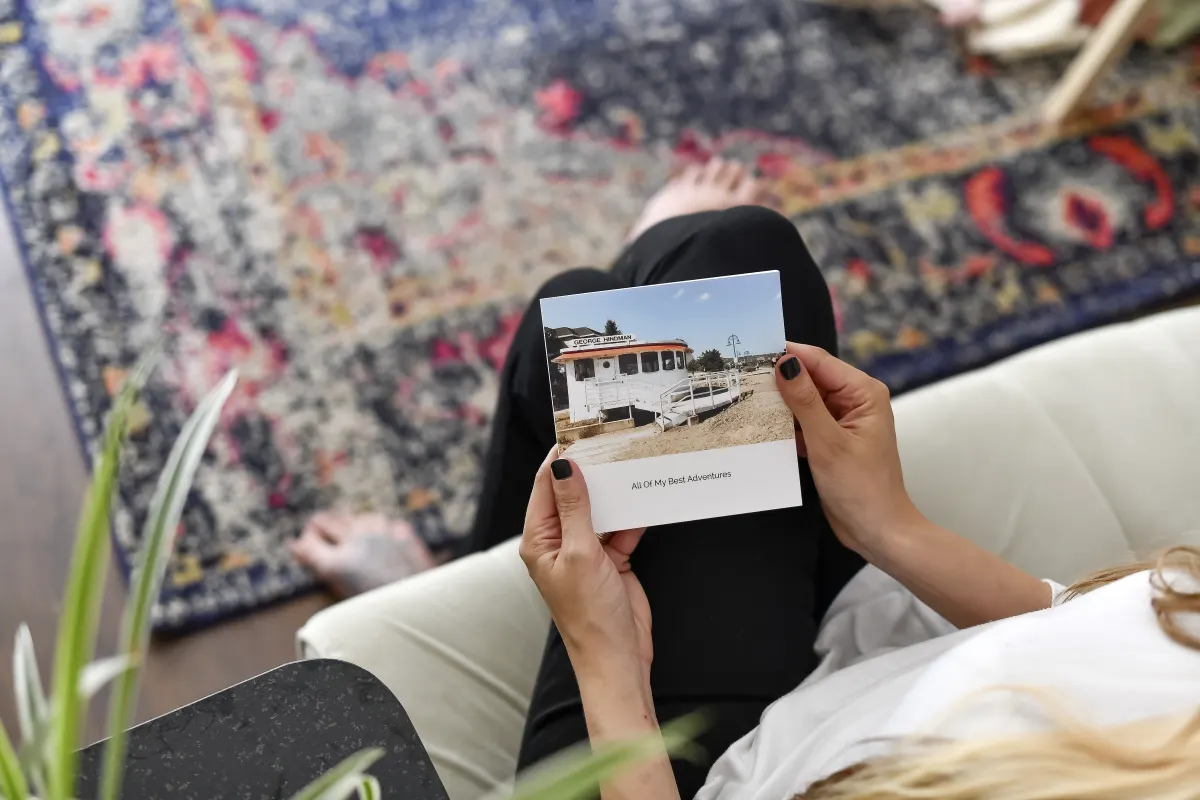


PARABO MISSION STATEMENT
We share in your joy, celebrate your story and help you hold onto life’s moments with thoughtfully-designed photo prints.
Learn More


AS FEATURED IN


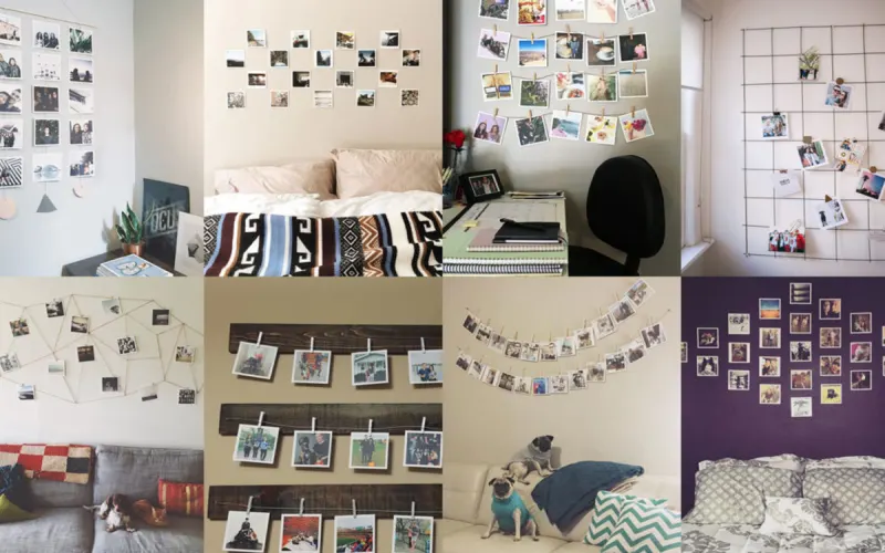
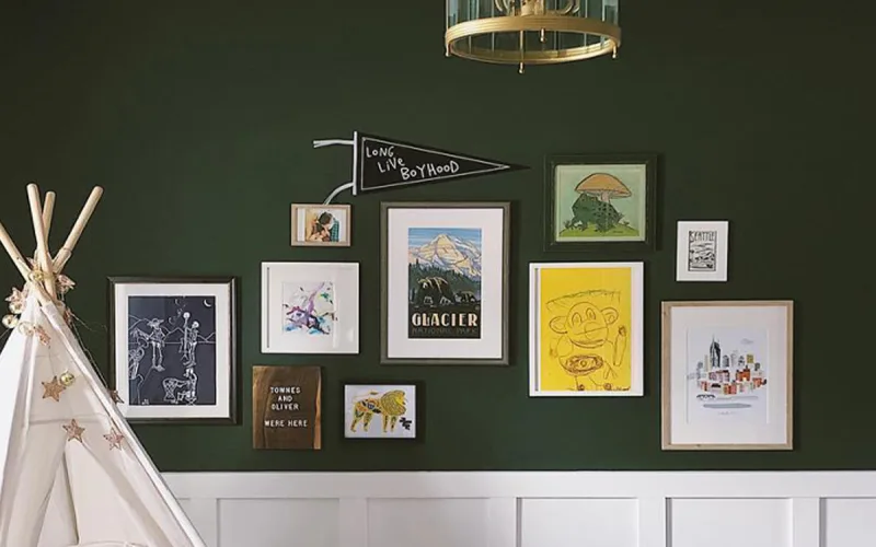
FROM OUR BLOG
SAVE 10% ON YOUR FIRST ORDER!
Be the first to find out when we have sales, add new products, or send along home decor inspo.
Subscribe To Our Newsletter